Paralyzed by Perfection (Or Turn it 90 Degrees)

I am in denial about being a perfectionist. The first time someone pointed it out, I was shocked – I’m not a particularly neat person (let’s go with “creatively messy”), I’m pretty low-key about many things in life — how could I be a perfectionist? Now, years later, I have to admit that I am, definitely, a perfectionist. Sometimes it serves me well – I have excellent attention to detail, I am willing to put the hours and hard work into a project to make it fit my artistic vision – and sometimes it is a real problem. 

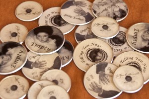
For the past several weeks I’ve been working on the labels in the above photo. It’s a technique using coarse embossing powder to create a translucent shell over an image. In the past I’ve used it to make a translucent disk and, at the beginning of this project, I tried to do that same process. I had all kinds of technical problems, finding a frame large enough (in the past I’d used metal washers), warping during melting, warping during cooling and, once I thought I’d solved those problems, I’d find out my sample pieces were the flukes and I really hadn’t solved the problems at all! To compound the issue, when I attached them to book covers, I realized I didn’t want them translucent after all – the adhesive (and any bubbles) showed right through.

Piles of ruined supplies later, I was so frustrated, I stopped working on my books. I kept missing one self-imposed deadline after another but couldn’t get myself back on track. I also couldn’t let go of that artistic vision that said these books need this kind of label. Sigh.

During this period of paralysis brought on by my own perfectionism, I went to the Maker Faire. If you’ve ever been, you’ll know it’s wonderfully overwhelming with a mixture of creativity that reminds me of a G-rated Burning Man. If you’ve never been, I highly recommend going at least once. They have them all around the country. But I am getting off topic as usual. Squirrel?

Back to the paralysis and piles of ruined materials. During the Maker Faire I had the opportunity to hear Fritz Grobe and Stephen Voltz of EepyBird.com speak. It was a fun and interesting presentation (you can have way too much fun wandering around their website) and, most importantly, they said something that will forever change the way I approach my artistic paralysis. “Turn it 90 degrees.”

Part of their process is to play with materials and, after hours of trying to get sticky notes to act like a slinky with no luck, they had the idea of turning the pad 90 degrees. That simple change (which took them hours to think of) made everything fall into place.

The next day, as I was sitting at the table looking at those labels, I remembered what they said, “Turn it 90 degrees.” Now in my case, turning the labels made no difference, but rethinking them from the ground up sure did. Rather than layering clear material with thin paper and more clear material, I printed on Rives BFK and used the heavy paper as a base with clear material on top. In that one change I solved all of my problems. The labels no longer warp, the adhesive no longer shows through and the paper backing allows for a better bond with the book cloth. Eureka!

Somehow solving that label problem unlocked my ability to solve the other technical problems I’d been having with other materials in these art pieces. Everything has fallen into place and I’m happy to say that I’ve finished almost all of the books I’ve been working on (that I’ve been stuck on, really). I’ll begin introducing them next week.

Thank you Mr. Grobe and Mr. Voltz. I now have a sign in my studio that says “Turn it 90 degrees.” I’m hoping in future moments of perfectionist paralysis that sign will spur my brain to creative mobility.

~Ginger

www.gingerburrell.com

The Joy of Raw Materials – Wet Adhesives (Glue)

Gluing is one of the most necessary parts of bookbinding – and also one of the most stressful. Other than Saran Wrap (which always wraps around me, not whatever I want it to), working with glue is one of my biggest challenges as an artist. I’ve gotten better at it, but I still get anxious at the beginning of a gluing session. All that beautiful book cloth and/or paper just waiting to become a new book, or a glue-y mess that can’t be used.

I use four main types of glue. I’ll share my favorites with you — and look forward to your comments.  I think every book artist has very strong opinions about glues. Which ones are the “right” ones to use, which ones are archival, which ones are absolute no-nos. It seems like there is at least an annual discussion on the merits or hazards of YES! glue on the Book Arts List Serv on the Book Arts Web hosted by Philobiblon.

The glue that I use most often is PVA. PVA is, according to Talas’ website, “a general purpose, resin based, internally plasticized polyvinyl acetate emulsion that contains no solvents. It is fast drying, very long-lasting and forms a transparent, flexible film.”  It is pH neutral and acid free. In other words, it won’t yellow and it is considered archival. The brand that I use, because it is readily available at local stores and because I can get coupons for 40% off, is Sobo. I’ve been using it for six years with excellent results. No yellowing, cracking or separation. The artists’ books I created with it six years ago look as good as the day they were made. I use straight PVA to attach sections of books together – for example hinges in an accordion book.

For book covers, I mix PVA with methyl cellulose (also seen as one word, methylcellulose). Again, according to Talas, methyl cellulose “is non-staining, will not discolor paper, will not decompose in dry or liquid state and is not affected by heat or freezing. Forms a highly flexible bond but is a weak adhesive.” Which is why I use it with PVA. PVA is an excellent adhesive but dries quickly. The addition of methyl cellulose allows for good adhesion and a longer drying time. That extra time is precious when working with cover materials that need a little extra manipulation or when the weather is warm.

 Book artists use PVA and methyl cellulose in different ratios depending on preference, humidity and working conditions. I prefer a 2:1 PVA: methyl cellulose ratio. A fellow artist friend, Janice, uses 50:50 to good effect. I use Elmer’s Art Paste brand of methylcellulose after being introduced to it in a class by Laura Russell. As a side benefit the methyl cellulose can be used with acrylic paints to make lovely paste papers.

For applications where I need to bond two pieces of paper together – laminate them – and I need the glue to be extra thin and not bleed through the paper, I use Rollataq. This glue is terrific for those applications, such as flag books, where you might want to create two-sided paper – perhaps a photo on one side and a color on the other – by bonding two sheets together. Rollataq sells a hand-held applicator that I’ve found to be invaluable for laying down a thin layer of glue. According to Rollataq’s website, “the glue will not soak through thin papers, will not yellow over time, is acid free and non toxic.” In Pendulum  I bonded paper printed with photos with the same black paper used to make the accordion part of the flag book structure so that the flags look like an integral part of the structure. You can see here that the flags are straight and well-bonded using Rollataq:

Lastly, there is the glue stick. I used glue sticks often when making a mockup or sample of a book I am working on. For quick, mess free gluing, they can’t be beat. I caution against using a glue stick for any application where there will be stress or torque such as an accordion book hinge. Glue stick is meant only for lightweight applications such as a piece of paper with a title to be glued to the front of a small book. In those cases, and when making mock-ups, I use the UHU purple glue stick. I like the purple color because I can see where I’ve put the glue, and I’ve found that this glue stick has the same qualities of any other glue I want for my artists’ books. It’s non-yellowing, acid free and non-toxic.

For gluing advice for adhering almost anything, check out thistothat.com. You can choose what you are attaching (fabric, paper, leather, metal, etc.) to your substrate (fabric, paper, leather, metal, etc.) and then press the “Let’s Glue!” button to get great advice on glue options.

Do you have a favorite glue? Feel free to add your comments.

There’s still time to enter the giveaway drawing for Breakfast. Subscribe by clicking the button to the right by 5/31.

~Ginger

www.gingerburrell.com

Why Artists’ Books if You’re a Photographer?

I am often asked the question, “Why books? Aren’t you a photographer?”

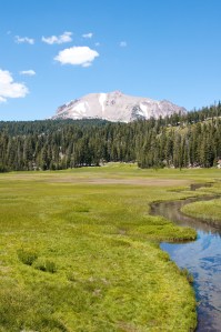
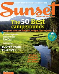
First I explain what an artists’ book is and then I begin to list why I chose to make them: the intimacy of holding a book, the way I can design the pacing, order and interaction with my images in a way that display on a wall can’t be achieved. I’ve always had a ready list, but the answer came to me most clearly and succinctly when I recently saw this Sunset Magazine cover that had my photo on it. Oh, not really my photo, but a near twin to one I’d taken. The photo, taken in a meadow in Lassen Volcanic National Park, is just one of many that I’ve taken that look pretty darned similar to photos I’ve seen in advertisements and magazines. I love to photograph outdoors  and so do many, many other photographers.

My Photo:

Sunset Magazine Cover:

I realized at that moment exactly WHY I choose to make artists’ books. I can take photos, great photos, and so can a lot of photographers. But only I can combine photographs, words, a chosen book structure and raw materials to create a particular artists’ book. No other artist will create that same pairing and that makes my work unique to me in a way that I’m not sure a straight photograph can anymore.

I think photographers are exploring this dilemma, largely created by the near universal presence of high quality digital cameras,  in many ways – the return to popularity of large format, toy and specialty cameras; the use of alternative processes, composite photography and staged photography; and the medium of artists’ books.

In fact, I think this is the difference between photographers and artists who use photography. Many of my favorite artists are good examples of this:  Brian Taylor combines alternative processes with beautiful framed book formats; Jerry Uelsmann is a master of composite photography – all done in the darkroom; Andy Goldsworthy’s photography serves to document his ephemeral artwork; and  David Maisel’s photography documents “the complex relationship between natural systerms and human intervention.”

Are you a photographer? An artist? Why do you make artists’ books?

~Ginger

www.gingerburrell.com