Tag Archives: Ode to Anna Atkins

Learning about What Has Come Before: Book Art in America

When I was at San Jose State University, some of my favorite classes were art history. I know. Snooze. But I had the gift of three amazing professors who love art history and made me  love it, too.

Dr. Max Grossman’s enthusiasm for art history was a defining moment for me. What seemed dry and drudgery became interesting, even compelling. In his Medieval to Renaissance class, Dr. Grossman talked about the art and artists as if he had been there. His knowledge of the backstories of great works of art made them come alive and had a lasting effect. Now at museums I recognize work we talked about, I understand its place in the history of art, and its significance to work that followed. I’ve become a better consumer of art because I’m more educated.

Dr. Dore Bowen‘s class Contemporary Art: The Thing sounds like a good name for a horror flick. Instead it was a thought-provoking journey through the art world from Duchamp’s Fountain to Jeff Koon’s Puppy and far beyond. And, while I didn’t always like the art (or even agree that it is art), I did learn to really think. Not just about the visual impact, but also about the intent of the artist, the social and cultural context when the art was made, and the influence of that art on all that follows. This class also led to two of my artists’ books, Rocks and You’ve Come a Long Way Baby.

Brian Taylor‘s History of Photography changed everything for me. I’ve loved photography since I was a little girl (I have the “heads cut off” photos to prove it) but, until this class, I had no idea about the incredible artistic range of this medium I thought I was good at.  As I learned about Anna Atkins, Edward Steichen, Imogen Cunningham,  Jerry Uelsmann, Alexander Rodchenko and too many others to name here, I realized that I knew nothing about photography and that I need to begin again. This class also led to new work including The Heaven Project and Ode to Anna Atkins.

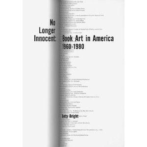
Why have I spent four paragraphs reminiscing about art history classes? This rather long-winded introduction leads me to my current foray into art history, reading No Longer Innocent: Book Art In America 1960-1980 by Betty Bright. I’ve had this book on my shelf for quite some time but I’d never actually opened it. One day I realized how much I was missing the reading and discussions from school and decided that this book would be a good start. I know a lot now about the histories of painting, sculpture, photography, but what do I really know about the history of my own media, book arts? So here goes, a self-directed art history class about book arts. I suspect, as the above mentioned classes changed how I view and make art, this book will also have an impact. I invite you to read along with me and join the discussion.

~Ginger

www.gingerburrell.com

The Joy of Raw Materials – Rives BFK

One of the joys of being an artist is choosing the raw materials for art. Like a chef choosing the just the right spices for a delicious meal, artists delight in considering every ingredient. I think for book artists, paper may be our greatest pleasure (although I’m already arguing with myself over the possibility that it may be bookcloth). Every detail, the weight, feel (or hand), color, and pattern – even the edges, deckled or not, is taken into consideration when choosing paper for a new artists’ book.

My favorite paper, and one I return to often, is Rives BFK. A printmaking paper, Rives BFK has no sizing and has a fabric-like hand. I think that part of experiencing an artists’ book is the feel of the pages when you are turning them and Rives BFK is always a pleasure. I began using it for litho, etching, and intaglio but now use it for cyanotype and inkjet printing.

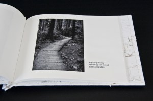
Rives BFK takes inkjet printing beautifully, but because there is no sizing, the ink sinks right in. To get a wide range of tonality in photographs, I use a low ink volume setting. This allows the ink to float on top of the paper and I’m able to bring out silvery gray values in black and white photographs. I’m often asked about getting the best quality print out of a printer and I recommend that you test print each type of paper you’re using with each option in your print dialog box. Print>Properties: experiment with combinations of print quality, paper type and ink volume. The investment in a few extra pieces of paper and a bit more ink will payoff in print quality. Here is an example page from Virtual/Reality:

Rives BFK also allows for double-sided printing without a hint of what is on the other side of the page. Although that can certainly be an interesting design element, I usually want my page to present only a single (or set) of images at a time. I don’t want distractions. In most cases I use BFK sheet, 250 gsm in white.

What is gsm? (When I started out writing this blog entry I had only a vague idea  so I did some research. I found it interesting and hope you do, too.) Gsm, also seen as g/m , is the weight or grams per square meter. The higher the gsm, the thicker the paper. According to Paper Mojo, “The European mesaurement of describing paper weight measures a single paper with a two-dimensional height and width of one square meter.”  You might want to take a look at their paper weight conversion chart.

Another challenge with Rives BFK is gluing. Flat gluing is easy. Gluing, as for a book cover, when you are folding the paper around Davey board, is a bit more challenging. Because Rives BFK has no sizing and is therefore more absorbent, the glue sinks into the paper and does not sit on the surface. This reduces the tackiness that makes the paper stick to the board when wet. Invariably the first time I tried it was late at night before a deadline and I was almost in tears with frustration – I pulled out the scotch tape and taped the edges of the paper around the back of the board while the glue dried. Before gluing in the final backing pieces, I removed the tape. This now my standard procedure when using Rives BFK as cover paper as in Ode to Anna Atkins:

Lastly, Rives BFK takes and holds a fold beautifully. Folding along the grain creates a crisp, flexible fold. This paper works especially well for post- and Japanese stab bound books for this reason. For best results, pre-score the paper before folding it.  I’ve also found it to be very nice for accordion books – the weight gives it enough stability to display well while open.

I’d love to hear your opinion about Rives BFK – or your favorite papers. I’m always looking for new ones to try.

~Ginger

www.gingerburrell.com

Ode to Anna Atkins

Ode to Anna Atkins is a new artists’ book that I’ve just released. I was fortunate enough to see Anna Atkins’ book, British Algae, while I was in New York. Though made in 1843, the images are still clear, beautiful and delicate. I was thrilled with Anna Atkins book when I first saw photos of it in Art History.  Having the opportunity to actually see it in person – a highlight of my trip to New York.

Empire State Building? That’s nice, honey. Oh, look! Cyanotypes…

My artists’ book is an ode to Anna Atkins using cyanotypes of flowers of Northern California. I just couldn’t get excited about algae. I showed it for the first time last weekend at Roadworks at San Francisco Center for the Book. Everyone loved the tiny little details visible in each cyanotype. The trick, press and dry the flowers first. Fresh flowers have too much dimensionality and create shadows in the cyanotypes. Very flat, very dry flowers are as effective as a digital negative.

The mottled background was very popular, too. I thought a clean blue background would be too one-dimensional with the flat white so instead of applying the cyanotype solution in a meticulous bi-directional two layered process, I used a sponge brush, only brushed in one direction and let the  solution pool slightly in some areas. It looks a bit blotchy in the photo, above, but the actual cyanotypes have more of a subtle morphing of color between areas. I’ve made 3  complete books out of the edition of 10 so I’ve got a lot more cyanotypes to make. Fortunately I love the process and the sound of the water while rinsing the images. It’s kind of like having one of those little fountains in the kitchen – it just happens to have photos in it.

This is a good time, too, to thank Brian Taylor, my alternative processes professor from SJSU, whose enthusiasm for cyanotype was the beginning of my own.