Tag Archives: Virtual/Reality

The Trojan Horse of Art?


This post is part of an ongoing series of discussion based on my reading of No Longer Innocent – Book Art in America 1960-1980 by Betty Bright.

In the introduction, Ms. Bright refers to Walter Hamady’s idea that artists’ books are “the Trojan Horse” of art. That books, a familiar, comfortable and trustworthy media, have the opportunity to be approachable, and at the same time controversial, in a way that another media might not.

What do you think? Have you made artists’ books that look pretty on the outside but have shocking content on the inside? Or artists’ books that appear to be about one thing but actually cover a more difficult topic?

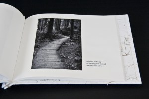
I agree with Mr. Hamady’s idea that artists’ books are the trojan horse of art and I often use that convention in my own artists’ books. Sometimes my content is thought-provoking, such as in Virtual/Reality where beautiful landscape photographs are paired with poetry questioning our social trend towards experiencing everything through a screen and, sometimes the content is shocking.

For my BFA show, which was largely about violence against women, I made a set of books where each page of each book has a news story from that day about violence against women. January 1, January 2, etc. I paired them with images on alternating pages and, most importantly, I’ve bound them in a traditional post binding with a beautiful floral cover. (Which ironically a reviewer didn’t get – they said the covers should have been plain.) The first impression is a pretty book. As the viewer begins to read the stories it is shocking, sad and physically draining. But the books underscore the reality that violence is happening against women every single day. And, by making them pretty on the outside, people were more willing to approach (even though the content of the rest of the show hinted at what might be inside). Interestingly enough, I never saw anyone leave a book part way through. Although it was exhausting, the viewers stayed with each book, every page, until the end. Many of them looked at all three books or three months of stories. Did the book format encourage this? Was the trojan horse aspect of pretty cover and difficult content the reason for the success of the books? Did the images I put in after each story give the viewer enough of  a rest to soldier on to the next? Here are some sample pages from one of the books, Paying for what was not her doing (January 2010):

This slideshow requires JavaScript.

What format decisions have you made to help a reader handle a difficult topic? Are your books subversive in some way? What do you think of Mr. Hamady’s idea?

~Ginger

www.gingerburrell.com

The Joy of Raw Materials – Rives BFK

One of the joys of being an artist is choosing the raw materials for art. Like a chef choosing the just the right spices for a delicious meal, artists delight in considering every ingredient. I think for book artists, paper may be our greatest pleasure (although I’m already arguing with myself over the possibility that it may be bookcloth). Every detail, the weight, feel (or hand), color, and pattern – even the edges, deckled or not, is taken into consideration when choosing paper for a new artists’ book.

My favorite paper, and one I return to often, is Rives BFK. A printmaking paper, Rives BFK has no sizing and has a fabric-like hand. I think that part of experiencing an artists’ book is the feel of the pages when you are turning them and Rives BFK is always a pleasure. I began using it for litho, etching, and intaglio but now use it for cyanotype and inkjet printing.

Rives BFK takes inkjet printing beautifully, but because there is no sizing, the ink sinks right in. To get a wide range of tonality in photographs, I use a low ink volume setting. This allows the ink to float on top of the paper and I’m able to bring out silvery gray values in black and white photographs. I’m often asked about getting the best quality print out of a printer and I recommend that you test print each type of paper you’re using with each option in your print dialog box. Print>Properties: experiment with combinations of print quality, paper type and ink volume. The investment in a few extra pieces of paper and a bit more ink will payoff in print quality. Here is an example page from Virtual/Reality:

Rives BFK also allows for double-sided printing without a hint of what is on the other side of the page. Although that can certainly be an interesting design element, I usually want my page to present only a single (or set) of images at a time. I don’t want distractions. In most cases I use BFK sheet, 250 gsm in white.

What is gsm? (When I started out writing this blog entry I had only a vague idea  so I did some research. I found it interesting and hope you do, too.) Gsm, also seen as g/m , is the weight or grams per square meter. The higher the gsm, the thicker the paper. According to Paper Mojo, “The European mesaurement of describing paper weight measures a single paper with a two-dimensional height and width of one square meter.”  You might want to take a look at their paper weight conversion chart.

Another challenge with Rives BFK is gluing. Flat gluing is easy. Gluing, as for a book cover, when you are folding the paper around Davey board, is a bit more challenging. Because Rives BFK has no sizing and is therefore more absorbent, the glue sinks into the paper and does not sit on the surface. This reduces the tackiness that makes the paper stick to the board when wet. Invariably the first time I tried it was late at night before a deadline and I was almost in tears with frustration – I pulled out the scotch tape and taped the edges of the paper around the back of the board while the glue dried. Before gluing in the final backing pieces, I removed the tape. This now my standard procedure when using Rives BFK as cover paper as in Ode to Anna Atkins:

Lastly, Rives BFK takes and holds a fold beautifully. Folding along the grain creates a crisp, flexible fold. This paper works especially well for post- and Japanese stab bound books for this reason. For best results, pre-score the paper before folding it.  I’ve also found it to be very nice for accordion books – the weight gives it enough stability to display well while open.

I’d love to hear your opinion about Rives BFK – or your favorite papers. I’m always looking for new ones to try.

~Ginger

www.gingerburrell.com