Have you ever gazed at images of perfect studios? You know the ones in magazines that are impossibly beautiful and organized? I often wonder about the palette (wall colors, not painter’s tool…) chosen and whether it fosters creativity or is distracting. Does it compete with the art making and finished art or highlight it?
One of the most viewed blog posts I’ve ever written was on the color of one’s studio and which colors facilitate creativity. I was building my own studio at the time and doing research. In the end, I went with white walls and a neutral floor color. Everything in my studio is white or natural wood, even the curtains are a natural and restful blue. Except that it isn’t. My studio is a cornucopia of texture, color and projects (or a rampant mess, depending on my mood…) I’ve got photos, artwork, inspiration, supplies, books, stacks, etc. adding color everywhere. I suppose you could say that my studio is actually every colored.
As an extension of the original post, which you’ll find here: While We’re Talking Paint Colors, I asked artists that I know through the Bay Area Book Artists about their studios and colors they’ve chosen, or not, and why. Here, in no particular order, are their replies.

My studio is blue based purple tinted out to a lilac color for walls and trim. Grey based white ceiling to reflect light back down into space, and flooring a light green. There are accent colors in all of the colors of the spectrum introduced in art work and assemblage pickings. Surrounding rooms are a saturated grey because it is wonderful to display artwork on. – Rhonda L.

1. My studio, as well as my entire living space, has white walls. I respond to emptiness, which white represents for me. The invitation of emptiness allows me to put up drawings, paintings, pieces of ephemera, words, and photographs that provide stimulation for creativity. 2. I feel that my creativity stems from a quiet center, and in order to have that quiet center, I need an interesting visual space. It’s almost as if the first creative act is to take the white walls, and begin a “room collage” of imagery that appeals to me, and once I’m ensconced in the arms of the imagery, my deepest creative place gets activated. This may look like clutter to others, but there is purpose, movement, order and balance to my eyes, and this is how I journey back to my center. – Karen K.

My studio walls are the color of leaves with a cream ceiling. My studio has windows on two walls and looks out on to the garden. I like the sense of working in the great outdoors, it makes me happy. That being said, the walls have lots of art, books and stuff on them, so the true sense is a garden that’s gotten outta control. It keeps me stimulated. (Raesofsun.com) – Rae T.

My studio currently has white walls and ceilings, with neutral to black surfaces and furnishings. It’s calming and visually quiet environment so that I can both work and play here. It’s not stark, as there are areas of creative clutter, but the overall space is peaceful and inviting for making art. The best moments are when I turn on some music and put my phone on silent. – Karen C.

My studio is Tiffany blue with white trim. I work full-time at a hospital, and this color helps me forget my day. I can think better at my studio. When I sit down to create, it usually never takes longer than 10 mins before ideas start to flow. – Linh D.

I don’t really have any colors. Behind me is floor to ceiling shelving with supplies. To my left is a huge cabinet with wood doors, though often they are open showing more supplies. Next to that we have the television sitting in a brick fireplace. In front of me, is mostly my huge iMac honestly can’t see much beyond it. (It’s new. 🙂 yay) and off to the right is an open area that turns into the kitchen area, again mostly wood cabinets there’s very little wall in the whole room, what we have is the same white as when we moved in. So I’d have to say my studio is “art supply” colored, mostly vintage paper and books. And the matte aluminum of my epson r2400 and iMac. I wish it were prettier like those spreads you see of people’s studio. I had Kit come help me organize it, but frankly, I work chaotically, and don’t have lots of energy to tidy up after, so everything is a massive pile of paper I’m working with, loosely held in clear plastic tubs. (Kit pointed out that I like to see what I have or I forget I have it, so clear tubs work great). I was raised by my Gran who liked need and tidy, so I always feel a bit of shame in regards to my work space. (https://www.flickr.com/photos/violentbloom/10355425414/) – Raven E.

My interior studio walls are warm white and with tomato red /orange accent walls and maple shelving with views of trees out my windows. My studio is a relaxing environment which sparks my creative energy. – Bernadette C.

I painted mine an ivory-white. Warm tone supports good vibes. Also good lighting helps. I have sky lighting plus warm light bulbs for night work. Has been great since 1984! ~ Jone M.

How color affects one’s creativity is a good question. I prefer white walls in a studio. I like to use colors and a placing a painting/print etc, against a white surface gives me the best idea of the true color, i.e. there is minimal color interference. I even prefer a white palette and ink rolling surface for that reason. Also white walls reflect light best. If I had my choice I would have one wall be a pale ‘photo’ grey, neither warm, nor cool, again for minimal interference with true color in a painting, print etc. BUT the best psychological stimulus to my creativity is having plenty of Northern light. Artificial light is a downer for me. – Conni R.

My last studio had knotty pine walls, very warm but too dark. I couldn’t bring myself to paint them because they were beautiful wood. I like a lot of light, from windows if possible, with no shadows under my hands. My new studio has slightly warm, white walls, our landlord’s choice. But it’s working well. I like the brightness. I feel most colors on the wall would bounce onto whatever I’m working on and have an effect. Later in a different setting my finished art would not be the color I want. My table tops are a light grey, I prefer my grey cutting mat over the dark green one most of the time, too. I think these simple colors create an environment that makes me feel like it’s a good place to be making things. ( judithhoffman.net) – Judy H.

My studio walls are white but you can barely see them. The walls are covered with every color possible of artwork and art supplies. This colorful atmosphere is what charges and inspires me. For me “more is more” in every sense of creativity. (http://lifeasafiveringcircus.blogspot.com/; http://www.doritelisha.com) – Dorit E.

In my studio I keep pretty neutral with color and have a Navajo white which has some warmth to it and grey. It makes a great backdrop for all colors and does not intrude. It keeps the space clean without being sterile and helps keep the light level up. The color is in all the inspiration pieces I have around. My artwork, objects that inspire, plants, and fabrics hanging on the walls or on shelves. There are a lot of natural items…rocks, wood, dried leaves and pods that warm up the space without effecting other colors. – Karen R.
What color is your studio? Or what color is your dream studio? Have you changed your studio color over time? If so, why? Please share in the comments!
Thank you again to the artists in Bay Area Book Artists. They are a tremendously generous group and always willing to share their thoughts and ideas.
~Ginger
http://www.gingerburrell.com
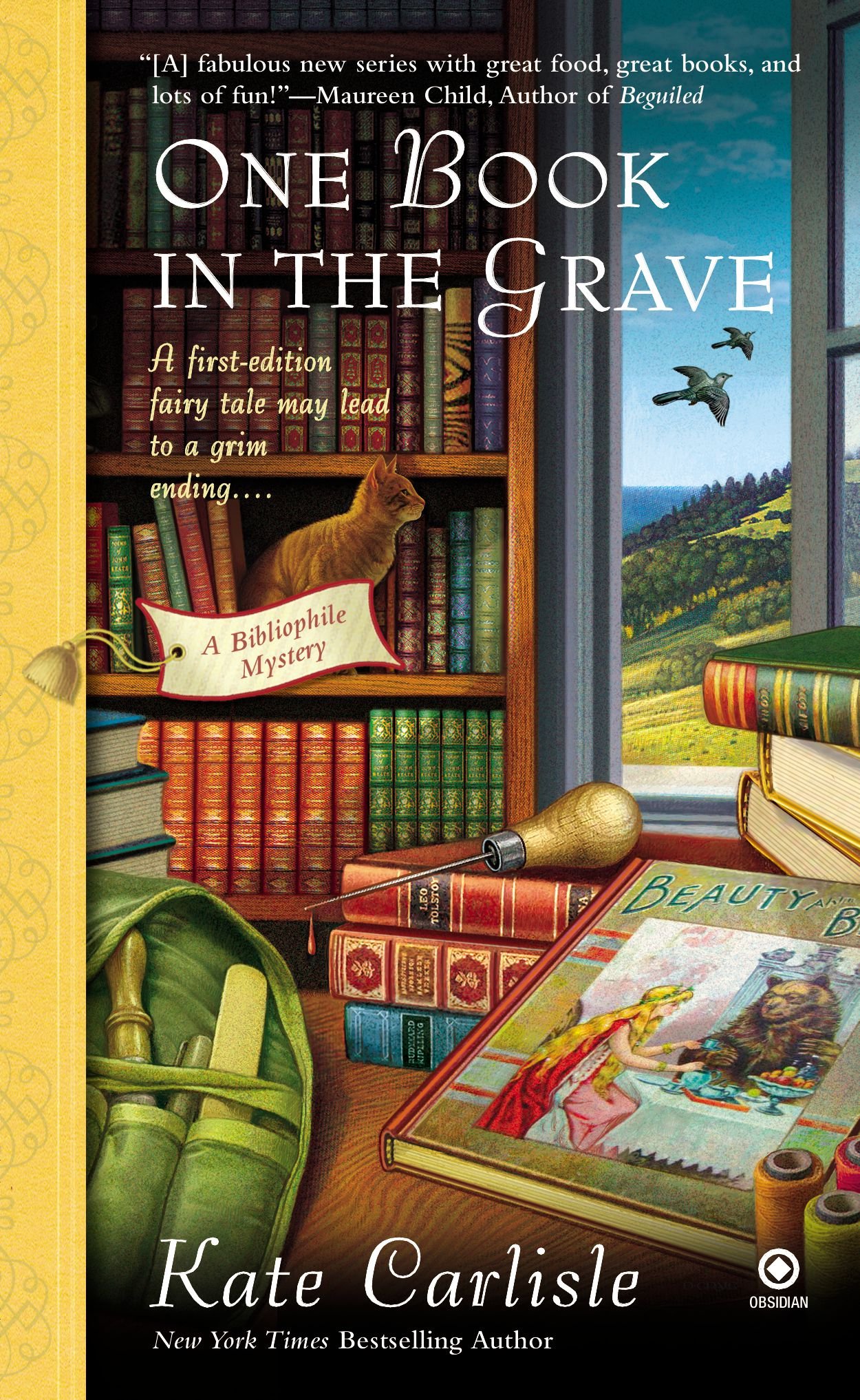
 Well hello again. Still working like crazy from Codex orders (this is a good thing!) but I thought I’d tiptoe back into blog writing with this quick post. My friend Marilyn S. asked if I’d ever heard of the mystery books by Kate Carlisle that have a bookbinder as the main character. Nope. I hadn’t. So I requested them from my library and they’re so fun!
 course) and there is a handsome man or two or three in every story. And a cat.
 Brooklyn lives in San Francisco, comes from Marin, and even mentions the San Francisco Center for the Book and the Bay Area Book Artists!


